Thoughts on Framer Sites
I spent a week learning Framer after years on Webflow. Here's what I loved (and what's still missing) — an honest take from a product designer who's shipped on both platforms.
6 min
I spent a week learning Framer after years on Webflow. Here's what I loved (and what's still missing) — an honest take from a product designer who's shipped on both platforms.
There’s a ton of buzz around Framer in the design community. If you use Twitter — you know what I’m talking about. My Twitter feed is a mix of people explaining why they moved from Webflow to Framer, new Framer updates, and general curiosity about the tool.
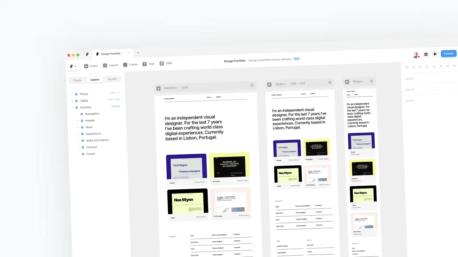
I wanted to see what all the fuss was about. So I started a mini project and took it for a spin. I built a simple one-pager portfolio template.
Then I documented my thoughts through the process.
I’ve used Webflow for the last few years, and I am a big fan of their product. I’ve used it for side projects, client work, and I sell templates on their marketplace.
I’ve been using Figma or Sketch for maybe 6 years. This is the first project I’ve used Framer Sites for — so there are likely many things I’m not aware of.
Framer (previously called Framer Sites) is a design tool — similar to Figma or Sketch. It has a typical interface for a design tool. A layers panel on the left, a styles panel on the right and an infinite canvas. So if you’ve used Figma or Sketch, you’ll feel right at home.
But the big difference to your design tool of choice is that Framer is also a powerful website builder. You can publish things to the internet right from your canvas.
This is a broad point — but it applies to many aspects of Framer’s product.
Publishing takes literal seconds. It’s a real wow moment the first time you hit publish and 2 seconds later your creation is a real thing on the web.
The interface is snappy, changes are instant, and I don’t think I've seen a loading spinner yet. It feels like it’s been optimised to stay out of your way. It works with you, not against you.
Compare this to Webflow which is carrying the weight that most 9-year-old digital products carry. You can feel the compounding effect of each decision, tradeoff, and bit of complexity.
Publishing a site on Webflow feels like it takes minutes, editing CMS items of large sites throws up a spinner on the reg, switching between pages takes seconds to react. And this is common, most things in Webflow take seconds. Which adds up.
You can tell the team hold a high bar for how software should be. It feels like a modern tool. It’s considered — they sweat the details and care about craft. There were no wtf moments.
At the moment Webflow definitely does more than Framer. But where there is a like-for-like comparison — Framer tends to do it better IMO. Whether that’s because it’s faster, less confusing, or just more pleasing to the eye.
A good way of thinking about this — if Webflow was to start from scratch today, what would they change? That is the head-start Framer has.
They ship fast. New features, functionality, and improvements are released on a near-daily basis. The product is changing and will continue to change as they fill the gaps between Framer and Webflow’s offerings.
All of this with an impressively small team (96 people according to LinkedIn). Evidently, a talented team that know what they’re doing. And from a product and design perspective, I admire what they’re doing and how they're doing it.
I’m excited about Framer now, but more excited about what Framer will soon be.
They have global styles for typography & colour and they have components. But I struggled with the bits in between — like part of a layout that wouldn’t justify a component.
Take page margins as an example. This is going to be tweaked for each breakpoint, but for a lot of cases, will be the same on every page (except a cheeky full-width something here and there). There’s no way to systematise this or set defaults per breakpoint. So you’re left manually changing the padding values for each section and breakpoint. And trying to remember what my page margins on mobile were again — was it 32 or 40 pixels?
Then you want to change the value? You need to manually update each section across every breakpoint. Take a 3-page site — that could be 56 values you need to change (6 sections × 3 breakpoints × 3 pages). Feels like it could quickly get out of hand and be a nightmare to maintain.
With a CSS class, you could change this globally with 3 padding values.
In order to simplify things for their target market (designers) concepts from HTML and CSS are abstracted. E.g. Flexbox → Stacks.
Potentially widens the gap between designers and engineers. But also means learning Framer doesn’t help with your knowledge of web development like Webflow does.
If I’m struggling to do something in Webflow and can’t find a solution in the Webflow forum. I’ll look for solutions in broader web development then try to apply those to Webflow. Whereas Framer's terms and concepts are mostly unique to Framer.
I found myself constantly overriding elements with a fixed width and height. Even with built-in Framer elements like a Grid, which had a strange fixed height value hidden in the advanced layout settings.
It’s rare I would make anything fixed width or height in a stack. So a more sensible default for me would be Width: Fill + Height: Fit Content. Then use a max width for more control if needed.
There was also some strange behaviour with my portfolio cards. I had the layout behaving as I wanted — then as soon as I made it a component the layout broke and parts of it reverted to fixed width.
In Framer, Interaction states can only be defined on components. While I think this is more reasonable for a design tool, as the output is a lower fidelity prototype of a real website, not a real website. I don’t think it makes sense for a website builder tool.
It feels like two separate concepts being forced together. If something is reused it should probably be a component. But having to be a component to have any interaction state didn’t click with me.
This raises a broader comment — desired behaviour in Framer will often depend if you’re comparing the tool to Figma or Webflow.
Play around with the tool. Try designing a small site — see how it feels. How des it fit into your workflow? Do the mental models for Framer click with you?
You can also get 3 months free on an annual Pro plan if you signup using this link and use the code pro-yearly-partner.
As a designer, being able to bring your ideas to life is an empowering feeling. The difference between a design in a Figma file and something on the internet that can be accessed across the world is huge.
I felt the same feeling when I learned the basics of Webflow. It opens a lot of doors and is a big addition to your skill set. Framer doesn’t have the learning curve that Webflow does — and I think it’s only a positive thing that the barrier to launching a website is lower for designers.
Framer is a very powerful tool — it’s easy to see the value it can add for designers. I still see a lot of value with Webflow — but If you want to get a small site live fast, it’s a really strong option.
And here is the outcome of my mini project: a minimal, one-page portfolio template.
Join 3,050+ designers · Unsubscribe at any time