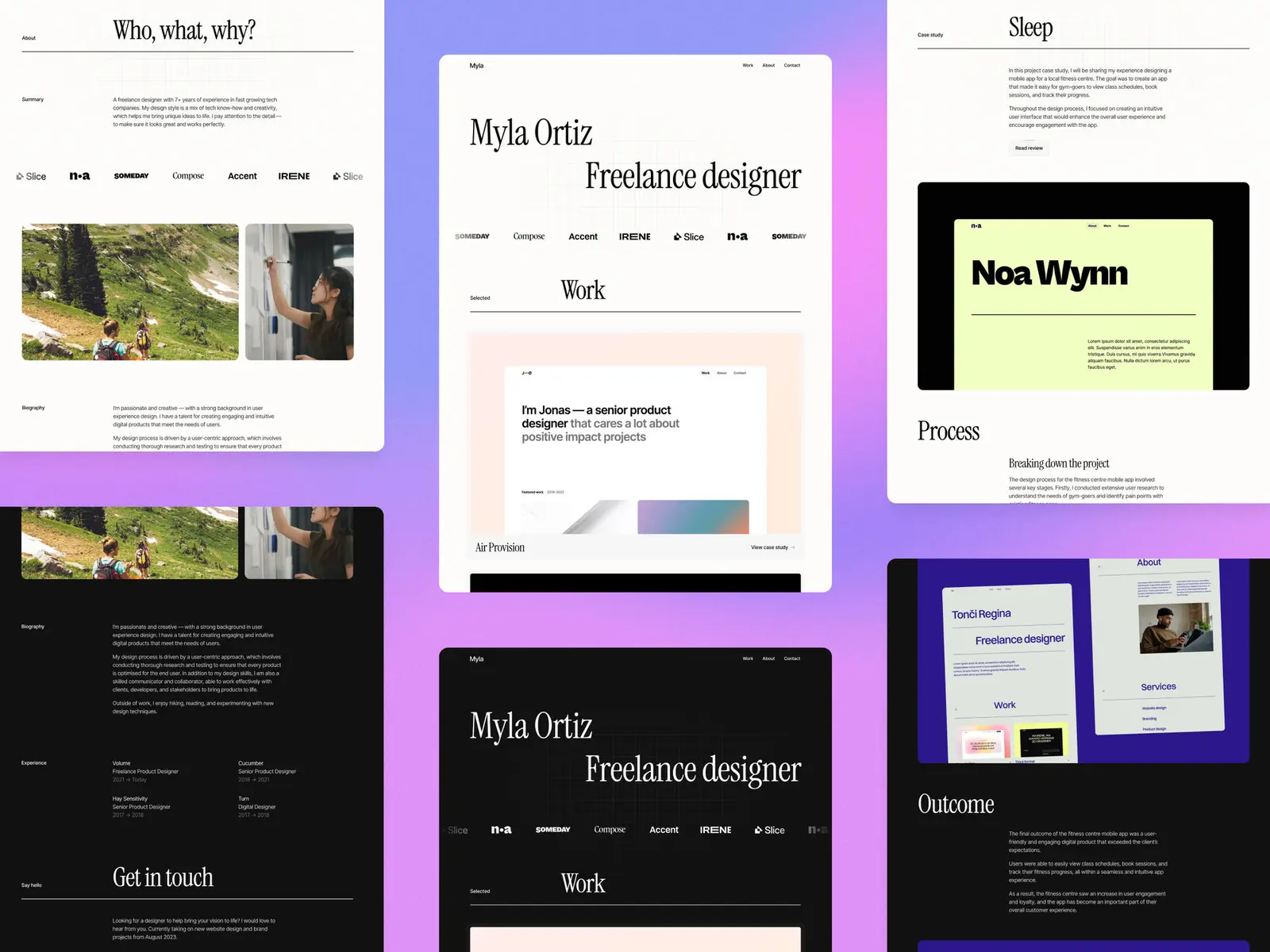
8 best Framer resume templates
The 8 best Framer resume templates for 2026. A resume site beats a PDF for anything creative — compare layouts, prices and pick one you can launch this week.

12 min
The 8 best Framer resume templates for 2026. A resume site beats a PDF for anything creative — compare layouts, prices and pick one you can launch this week.
A PDF resume gets skim-read in a tab and closed. A URL gets opened on a phone, forwarded to a hiring manager, and remembered — and for anything creative it shows the work instead of describing it.
The trap is building a portfolio by accident. A resume site needs your experience readable in about thirty seconds, a few pieces of proof, and a way to get hold of you. These eight Framer templates all get there without a long build.
Most people over-build this. You’re not competing on how much you can fit on the page — you’re competing on how fast someone can decide to reply to you.
Everything past that is decoration. Pick the template with the layout closest to that list and you’ll be live in an evening.
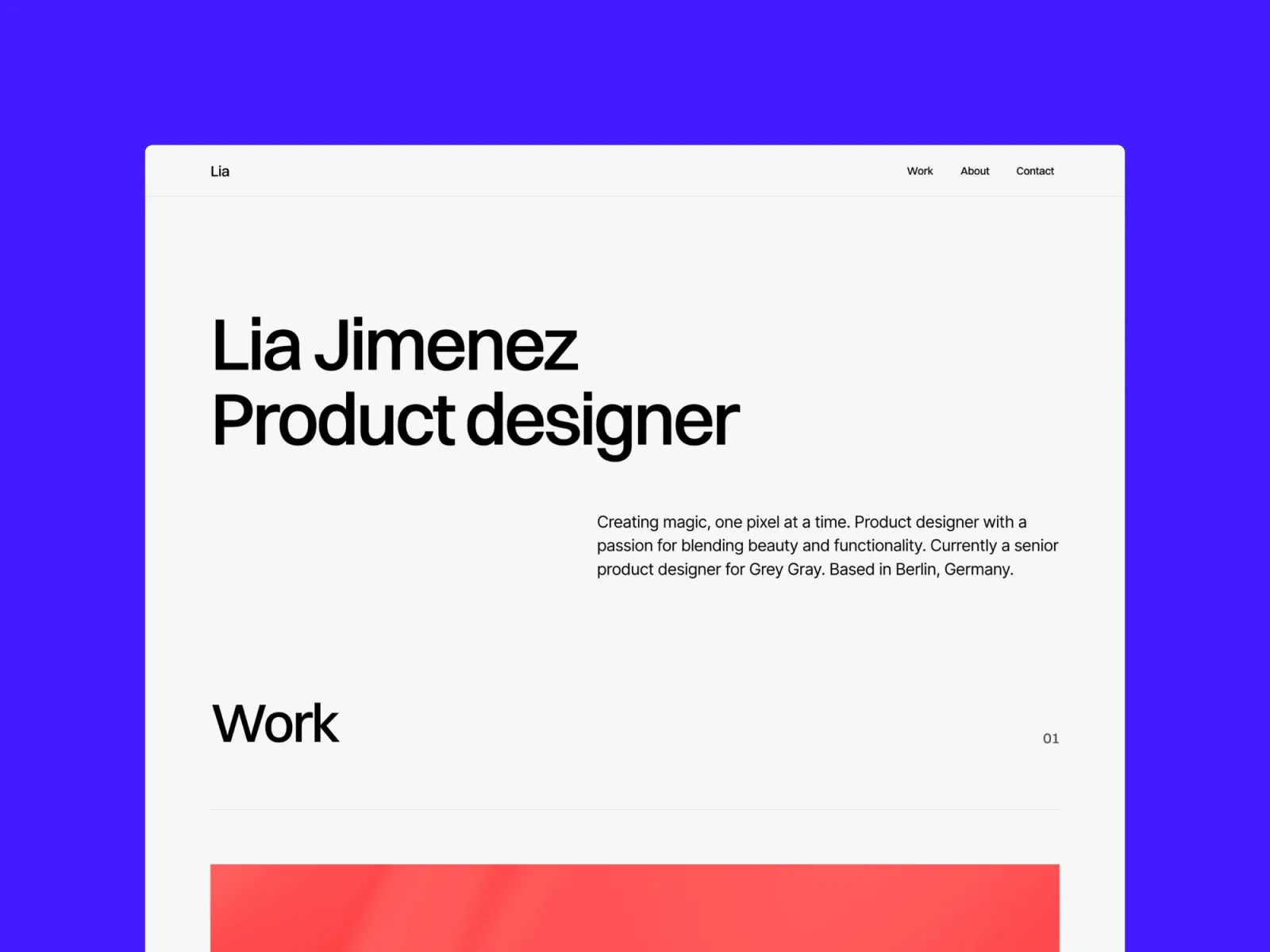
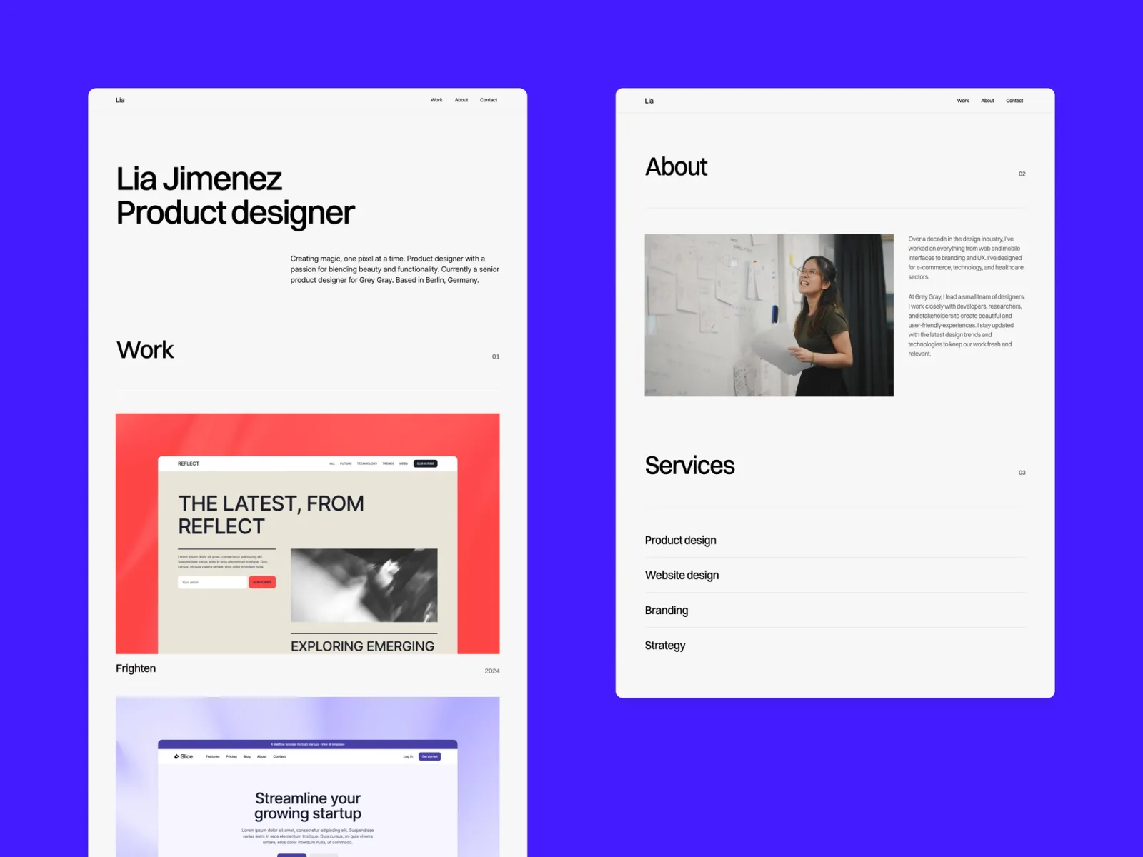
The shortest route from nothing to a live resume site. Four pages — home, about, work and a 404 — and no structure to fight with. There’s no separate project page, so deep case studies have nowhere to live; that’s the trade for how fast it goes up.
Designers applying for roles who need a live URL by the end of the week and would rather spend the time on the application itself.
$149 · Single site licence
Preview · Get Minimal portfolio →
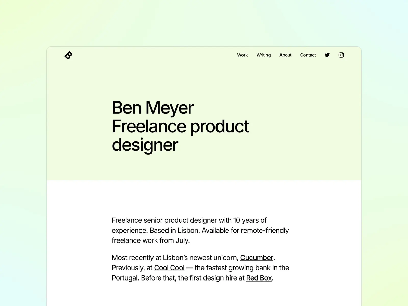
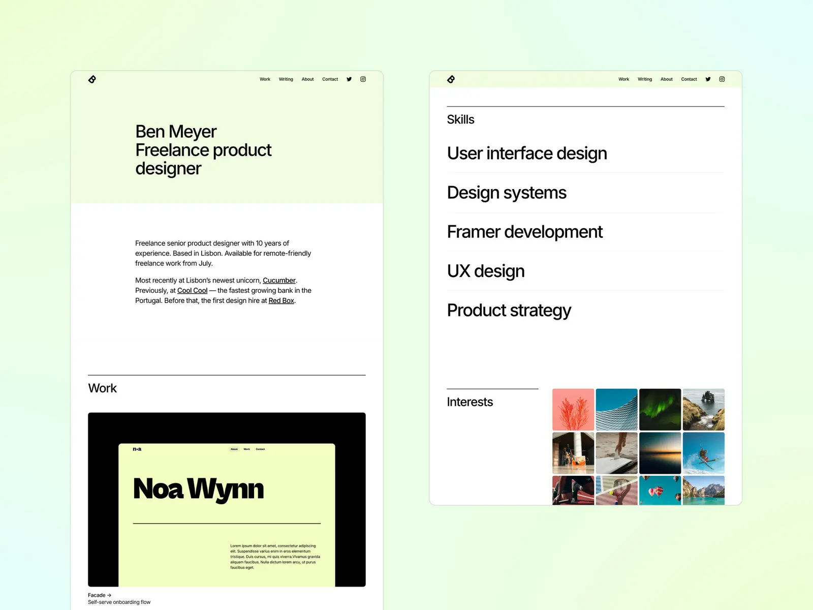
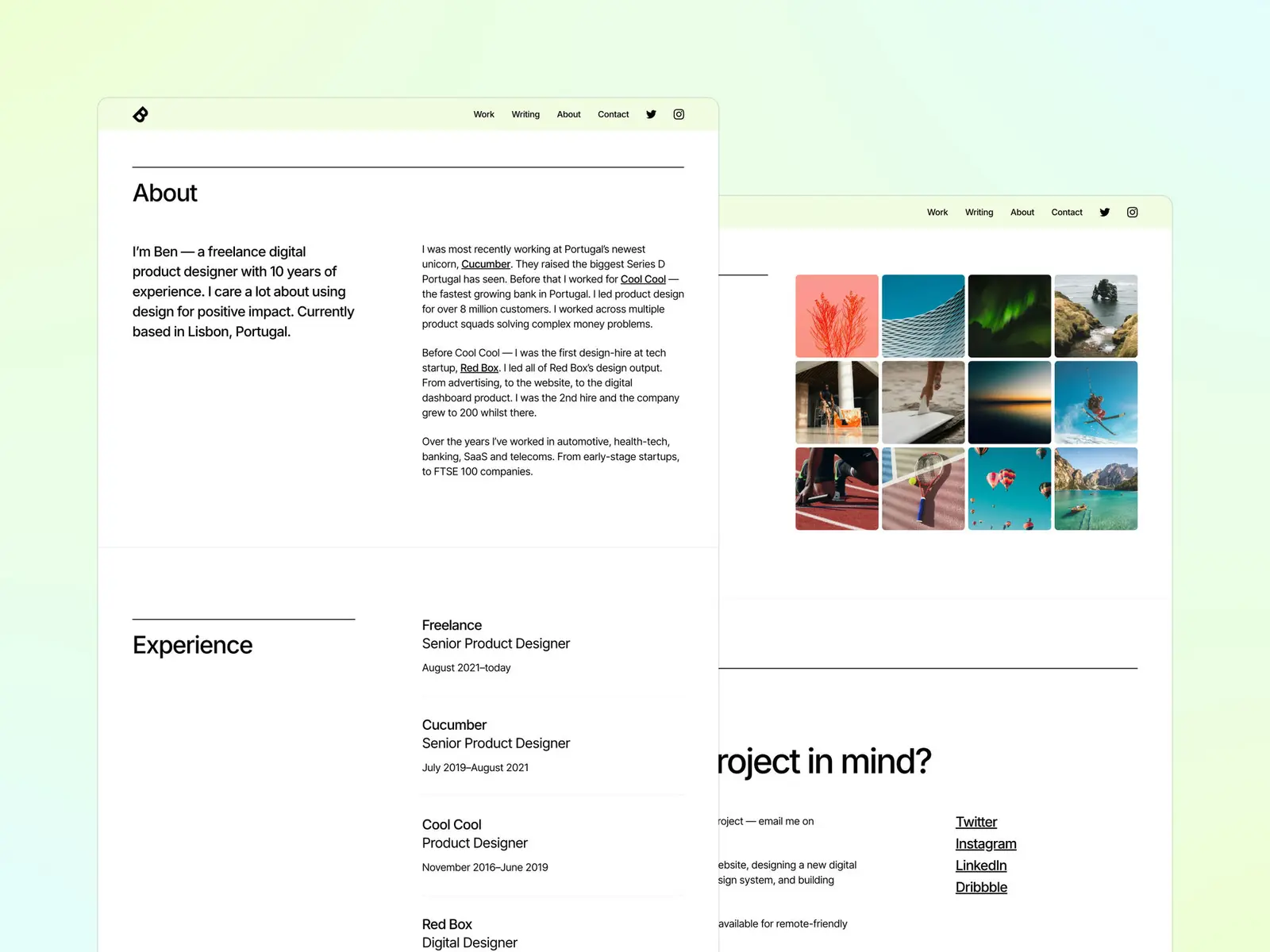
Format reads like a well-set CV. Clear type hierarchy, generous spacing, and sections that scan in order instead of competing for attention. Three pages only, and no automatic dark mode — it commits to one look and sets it well.
People applying into structured teams — in-house design, research, product — where a recruiter is scanning for dates and titles before anything else.
$149 · Single site licence
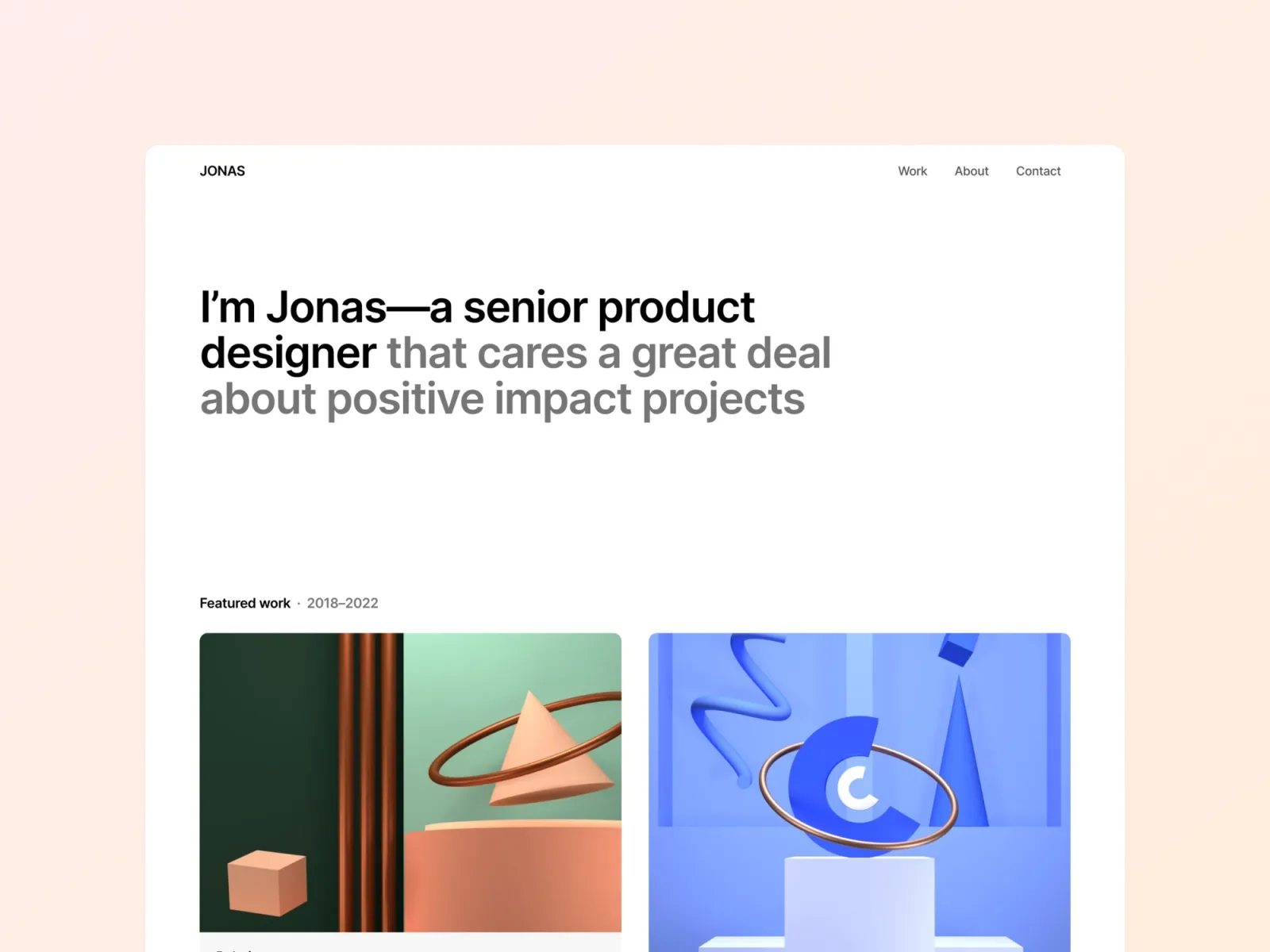
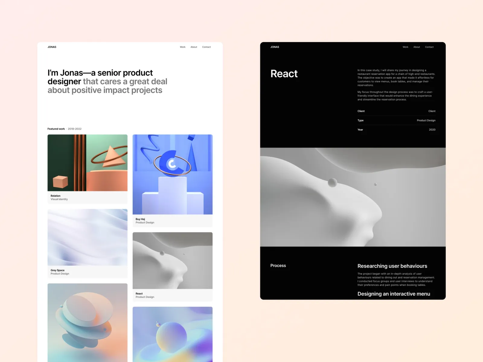
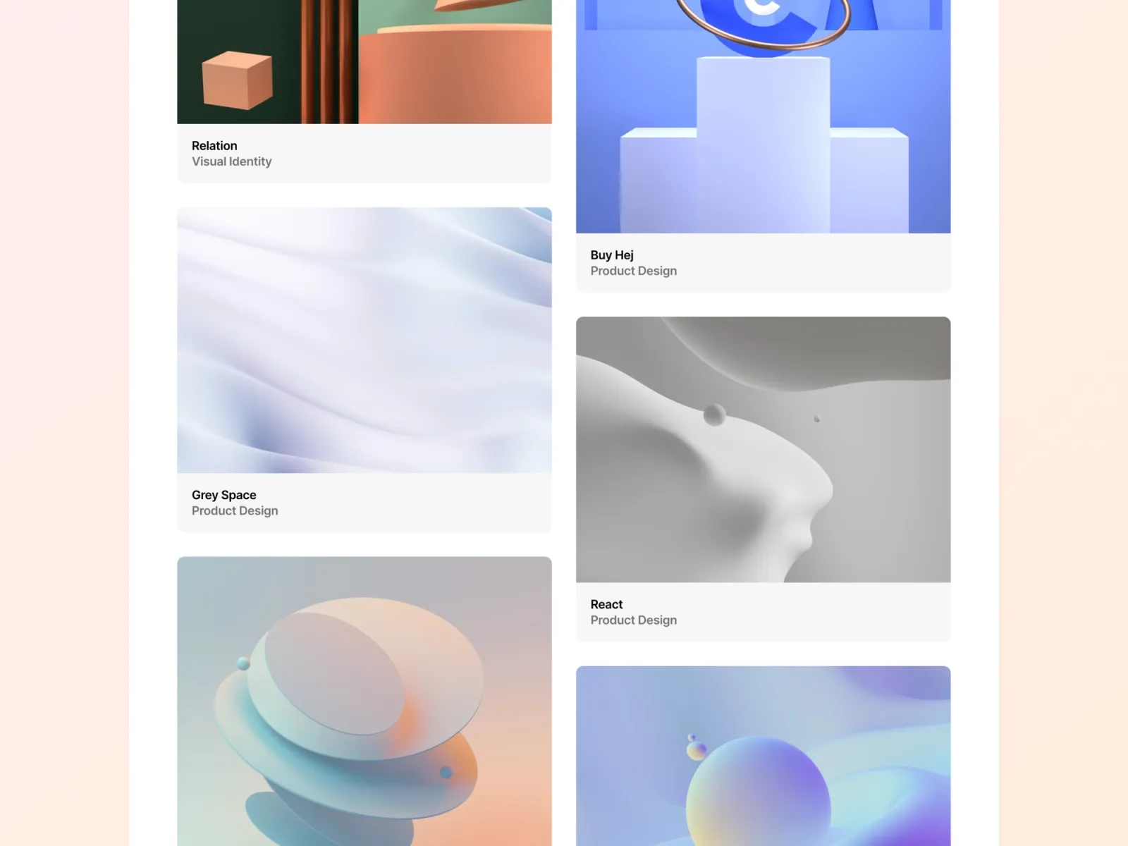
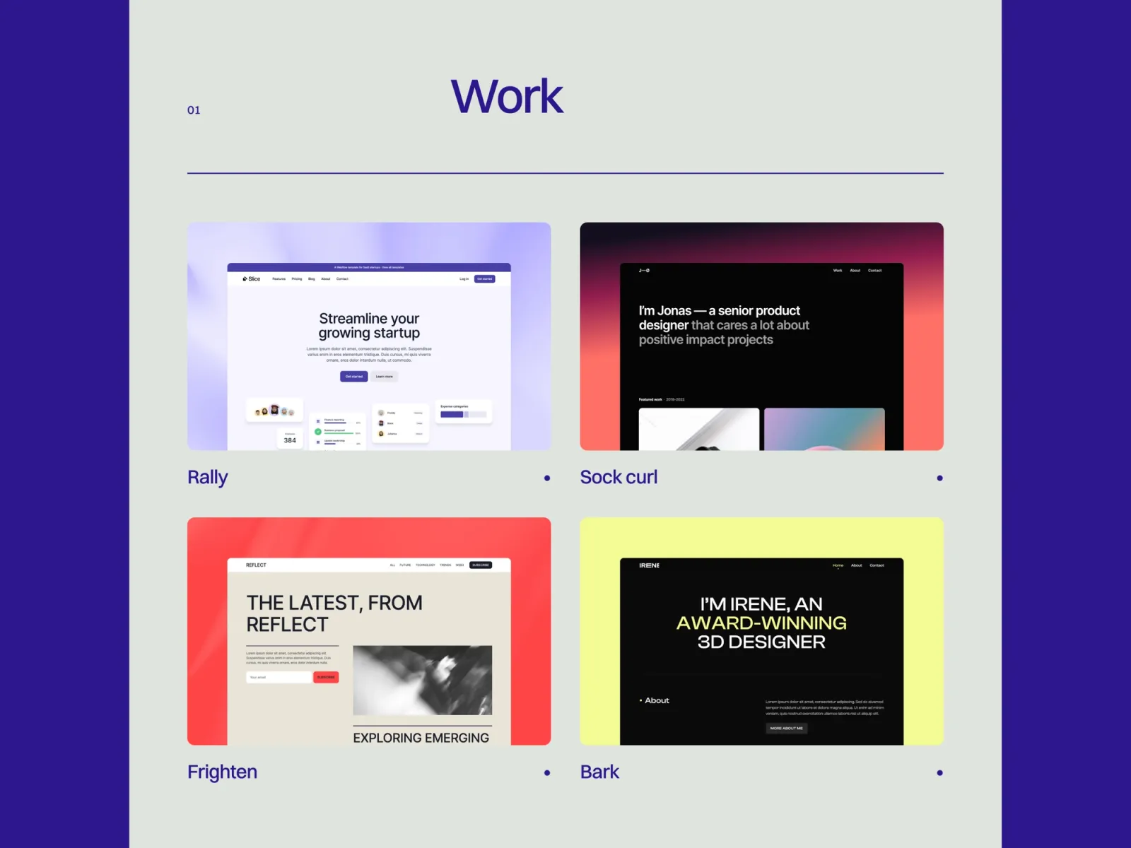
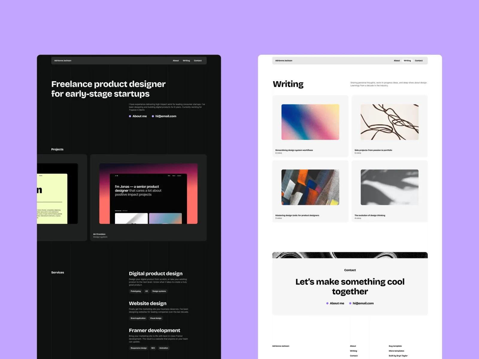
Jonas leads with a short personal statement and moves straight into work. The structure suits someone whose case for hiring is the projects more than the job titles. Same three-page footprint as Format, but with automatic dark mode and a page-load animation.
Career changers and freelancers going permanent, where the work makes the argument that a job title can’t.
$149 · Single site licence
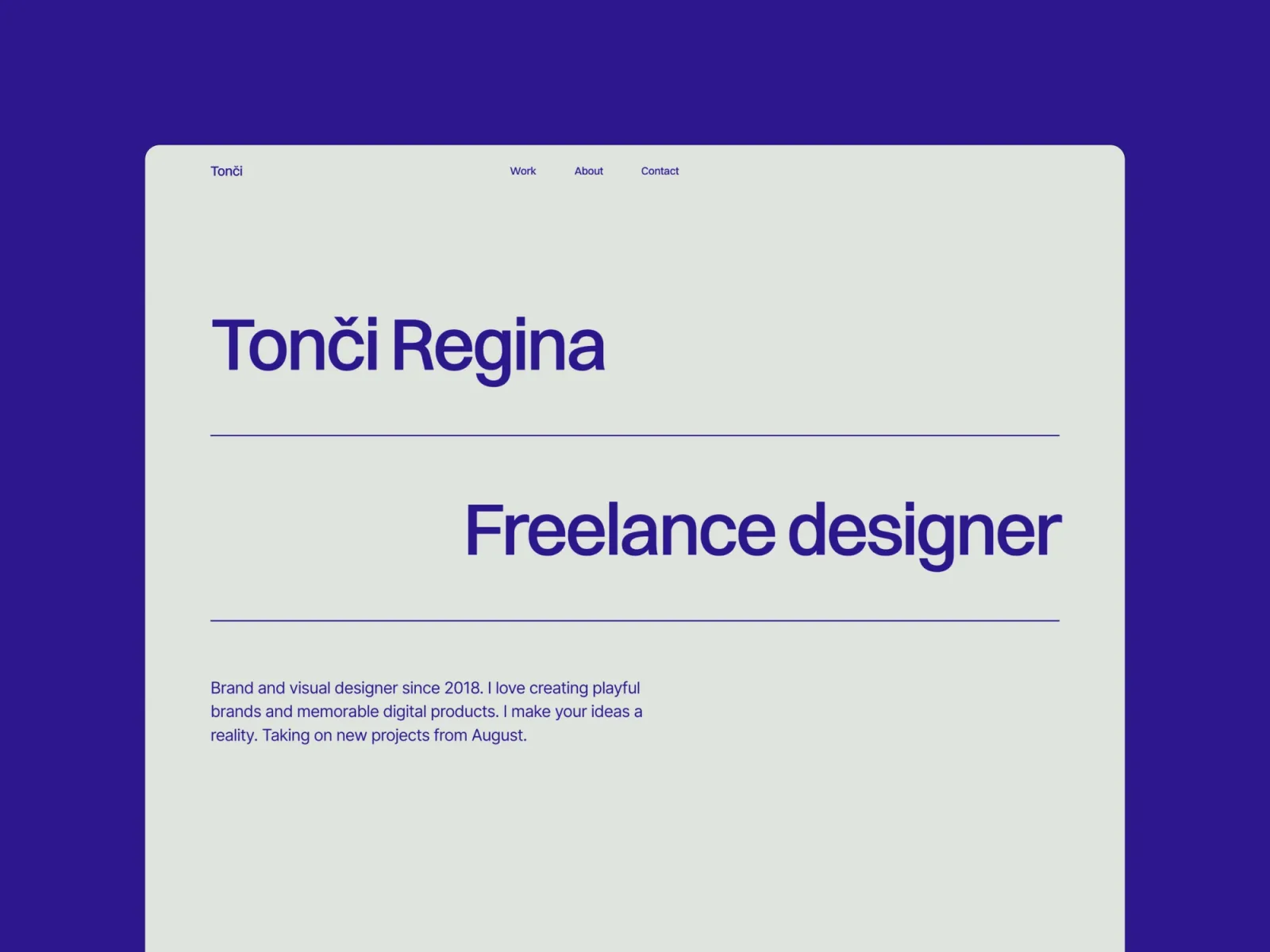
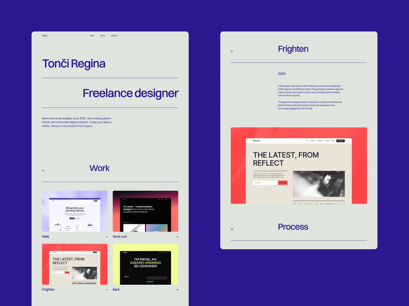
Accent is minimal with one strong colour doing the work, set as a global variable so the palette is a single change. Three pages, and no about or contact page — everything lives on the home page, which keeps it short but limits how much history you can show.
Junior and mid-weight designers who need to stand out in a long shortlist without resorting to novelty.
$149 · Single site licence
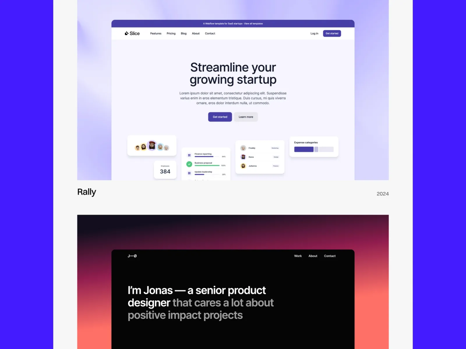
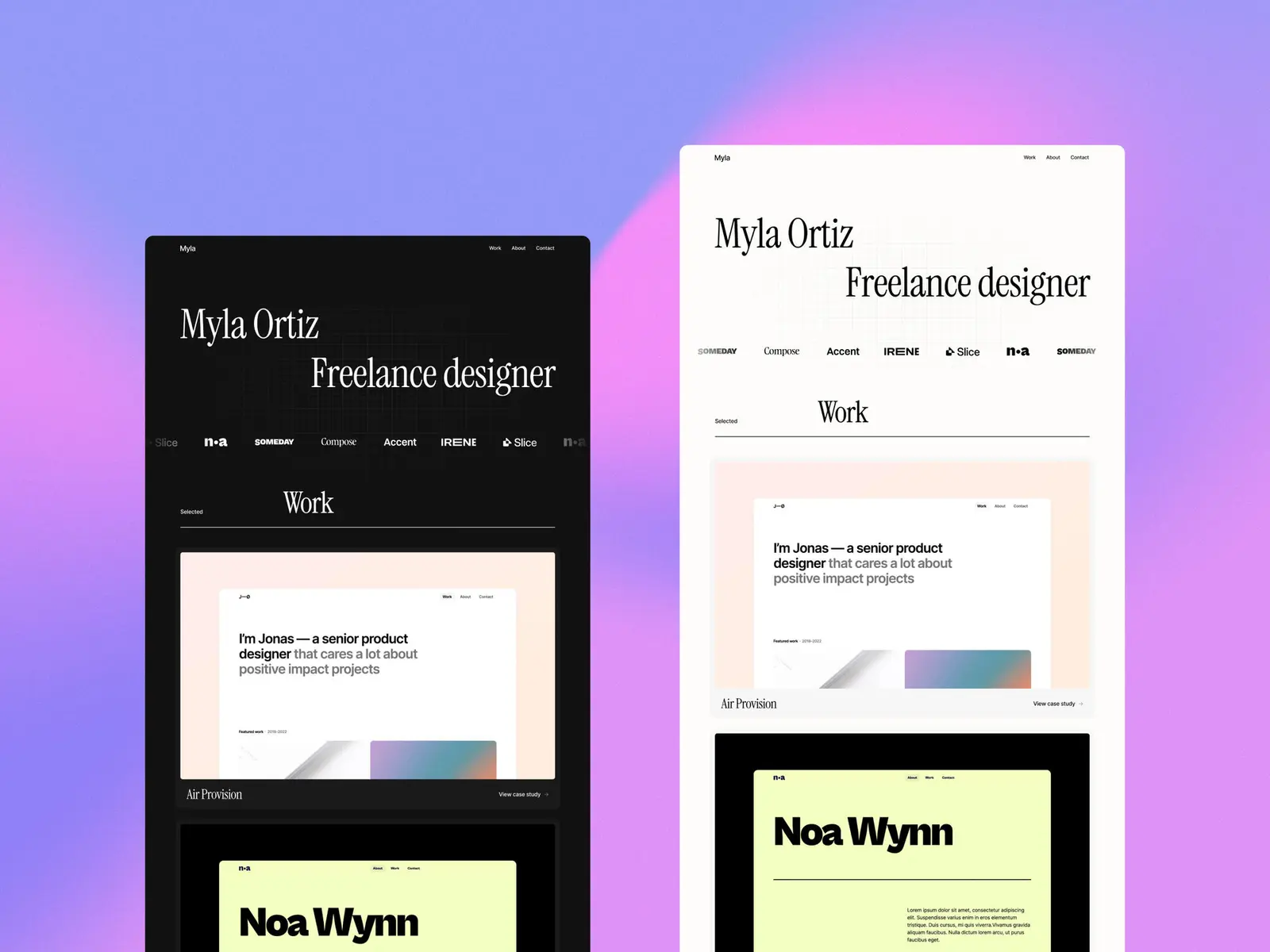
Sharp is the most confident layout here. Big type, 3D transforms on the hover states, and a CMS that drives writing as well as work — so a resume site can carry a case study and a written piece side by side. No automatic dark mode.
Senior and lead designers whose interviews turn on process and decisions, not screenshots.
$149 · Single site licence
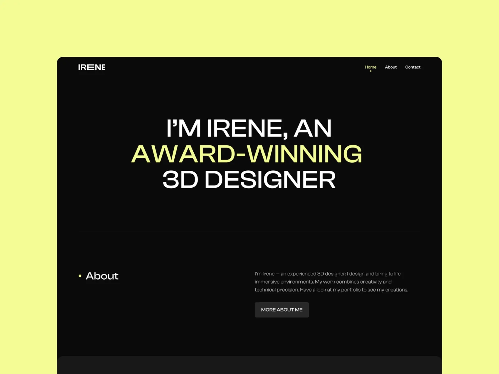
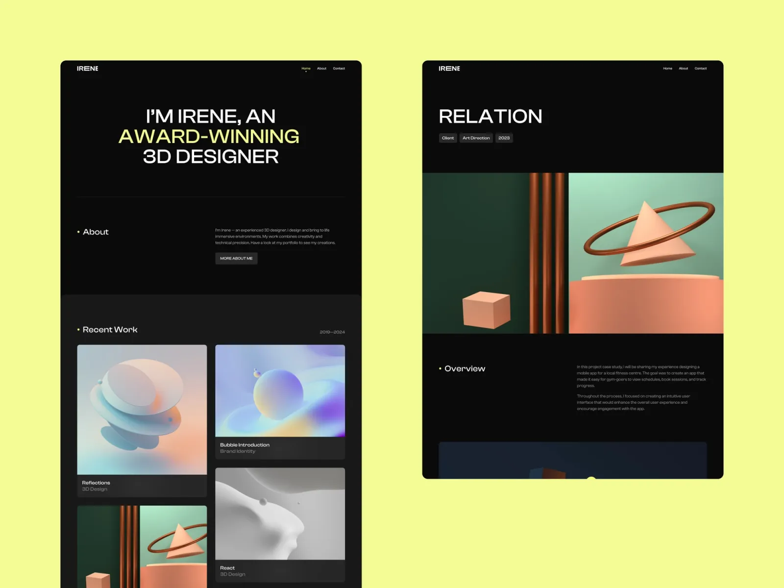
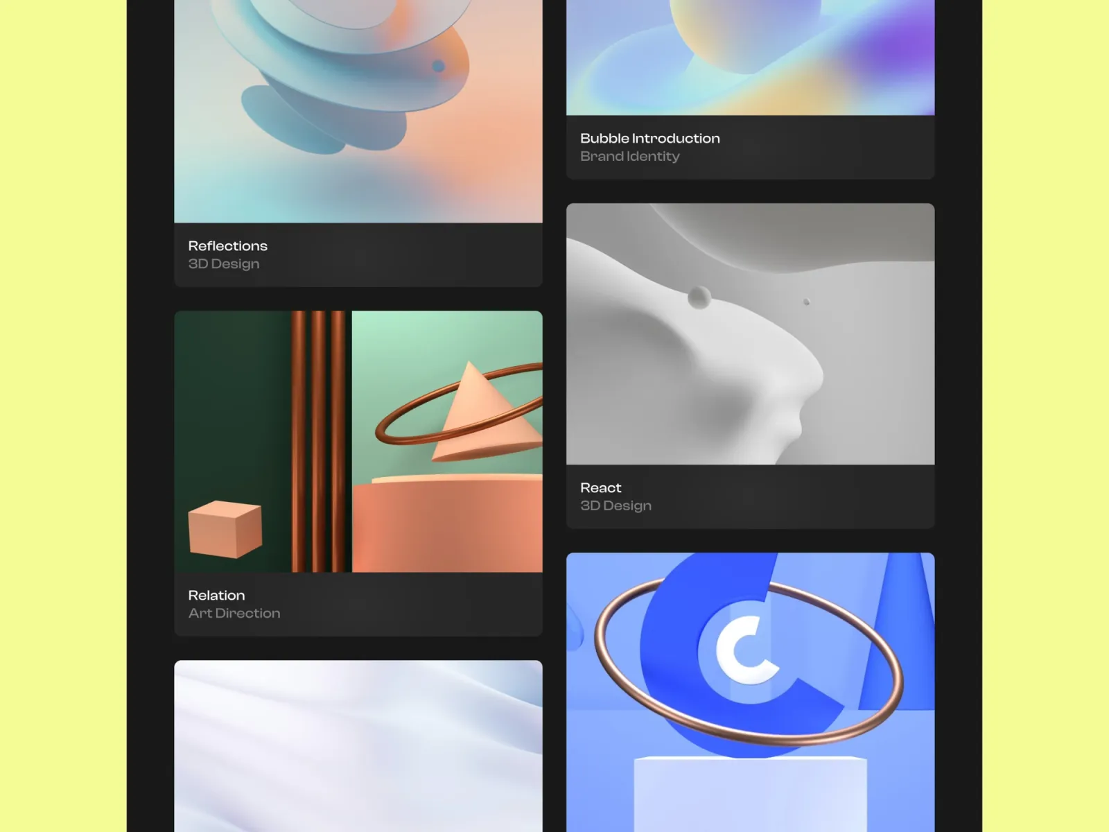
A dark resume site, done properly. Irene keeps contrast high enough to stay readable, which most dark templates get wrong. Five pages including dedicated about and contact — the most complete structure here after Offset.
Product and UI designers whose work is mostly interface screenshots, which read better against a dark background.
$149 · Single site licence
Lucid adds a proper writing section to a plain resume layout — seven pages, with work and writing on separate CMS collections. If you’ve written anything worth reading, it gives you somewhere to put it that isn’t Medium.
Designers and researchers applying to roles where writing is part of the job, and a writing sample helps the application.
$149 · Single site licence
Offset gives you six pages, so experience, work and contact each get their own room instead of stacking into one long scroll. Light and dark follow the visitor’s system setting. More setup than the three-page templates here, and worth it if you’re in for a long search.
People in a long job search who want a site that keeps working as a portfolio afterwards, rather than one built for a single application.
$149 · Single site licence
Pick on how long your search is likely to run. For one or two applications this month, Minimal portfolio or Accent will be live tonight. For a search running into next quarter, Offset or Irene give you the about and contact pages the three-page templates don’t have.
On tone: Format and Offset read as professional, Accent reads as confident, Irene reads as technical. Sharp is the one to take if an interviewer will ask you to talk through a decision. Pick the one closest to the room you want to walk into.
One thing worth saying — a resume site doesn’t replace the PDF. Most application systems still want a file upload. Keep the PDF, link to it from the site, and let the site do the persuading.
Browse the full range of Framer resume templates, or see every option on the Framer templates page.
No. Every template here is edited by clicking text and swapping images. You need a free Framer account, and you connect a domain when you publish. No code at any point.
An evening for the three and four-page templates if your content is ready. The longest part is writing the copy and choosing which projects to include — not the build.
Use both. Most application systems still require a file upload, so keep the PDF and link to it from the site. The site is what people share and remember.
Three to five. A shortlist reads as editing ability. Fifteen projects reads as an archive and nobody gets to the end of it.
Minimal portfolio, Jonas, Lucid and Offset switch automatically with the visitor’s system setting. Irene is dark by design. Format, Accent and Sharp are light only.
Yes, and Offset and Lucid are the two built for it. Both have CMS-driven sections and enough pages to keep adding to long after the job search is over.
Buying more than one? Unlimited Access bundles every Framer template and component for less than the price of two.
Join 2,900+ designers · Unsubscribe at any time